Held to One Style: Illustrating a Whole Deck Alone
The hard problem in illustrating a game is not making one striking image. A generative tool will hand you a striking image on the third try. The hard problem is making ninety of them look like they came from one world, one hand, one afternoon of the same artist in the same mood. A card game is a crowd of pictures seen at once. The player fans a hand, scans a row of threats, opens a gallery of everything they have unlocked, and every image is judged against the one sitting next to it. Consistency is the deliverable. Consistency is also the exact thing a lone author armed with a text-to-image model is worst at holding.
Every generation is a fresh roll of the dice. Ask for the same character twice and you get two cousins, close in the face and wrong in the light, one lit warm and one lit cold, one painted and one glossy like a photograph. Stack forty of those and you do not have a world, you have a folder. Talent does not fix this, and neither does taste applied one image at a time, because the drift happens between the images, in the gaps you are not looking at. What fixes it is a system that turns the look into a fixed input instead of a decision you re-make on every prompt, plus a gate that fails any picture that wanders out of the set. This post is how a solo author keeps a whole illustrated deck on-model: lock the style, give it a grammar, and judge every file before it ships.
The Enemy Is Drift
Drift is the slow divergence of a set that was never pinned down. No single image is wrong. The nineteenth foe is a shade more saturated than the third. The backdrop you made on Tuesday reads cooler than the one from Monday. The card you regenerated because you liked it better now sits half a stop brighter than its neighbors. Each one, alone, is fine. Together they tell the eye that nobody was minding the whole, and the fragile trick, that this is a real place with a real history, snaps on the seam.
Players rarely name it. They feel it the way they feel a novel where chapter nine forgot a rule chapter two established. Something is loose. The immersion has a draft coming through it. And a deck is the worst possible place for drift, because you never see a deck one card at a time. You see it as a hand, a shop row, a reward screen, a gallery. The comparison is built into the format. You are not showing your best image, you are showing your least consistent one next to your best, forever.
Lock the Look, Then Stop Deciding
The first move is to stop choosing the style at all. Most drift comes from re-deciding the rendering on every prompt: this one a little more cinematic, that one a little more painterly, because you are describing the look in words and words are slippery. The answer is to settle the look once, outside the prompt, and then never touch it again.
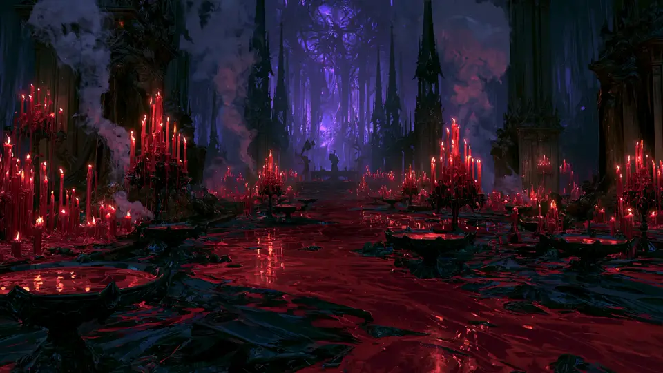
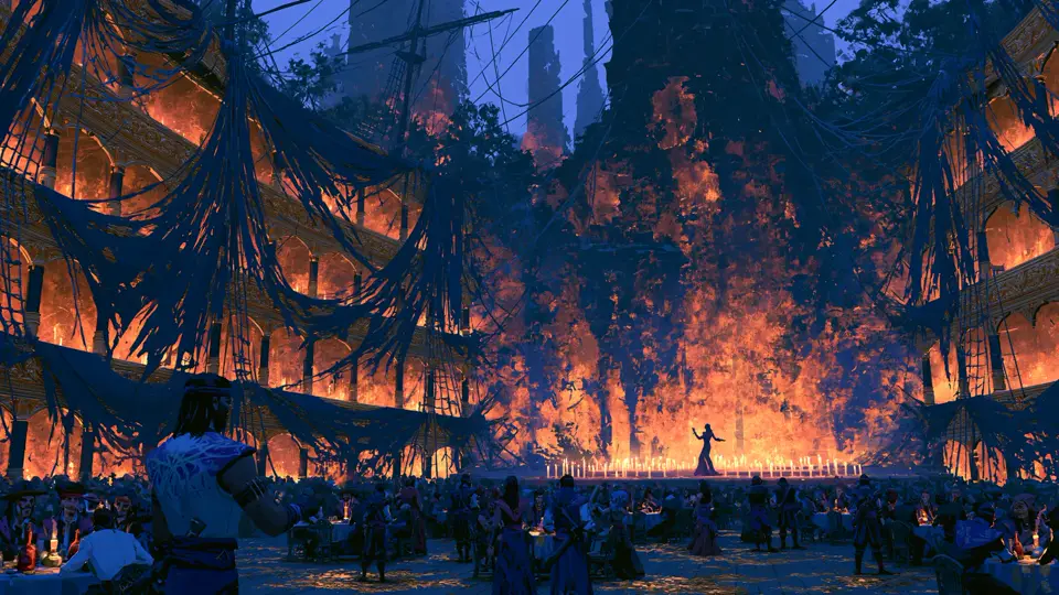
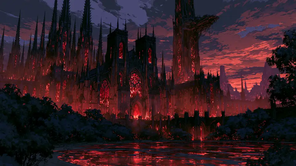
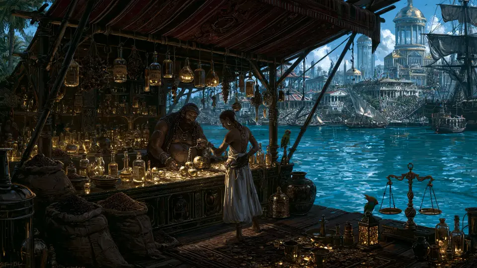
Modern image tools let you save a style as a persistent reference the model keys off of, trained once on the exact rendering you want and then attached to everything you generate afterward. Mine lives as a private handle I do not publish, tuned to a single painterly, grimdark register, and it rides on every prompt in the project. I keep the digits to myself for the same reason a studio keeps its LUTs and brushes in-house: the look is the fingerprint, and a fingerprint you hand out is not yours anymore.
The important part is what this frees the prompt to do. Once the rendering is locked, the prompt only ever describes the subject: a gaunt blood-priest scourging himself, a drowned matriarch weeping green light into black water, a reliquary keeper cradling a burning casket. It never argues about the lighting or the finish, because those are already settled. The words carry the who and the what. The saved style carries the how. Ninety subjects, one how, and the set holds.
A Grammar, Not Just a Style
A locked style keeps the paint consistent. A grammar keeps the meaning consistent, and a game needs both. Beyond the look, the whole set obeys a short list of rules that a player learns without ever being taught.
Color is the first rule. The combat runs on four forces, and each force owns one color of light. Flame is lit amber and ember. Blood is arterial red. The void is violet. Corruption is a sick, luminous green. Every card and every foe is dominated by the light of its force, with the other colors allowed only as accents. That is not decoration. A player reads a card’s allegiance from six feet away, before a single word registers, because the image already told them.
Framing is the second rule. Foes are a single figure, portrait orientation, a plain dark ground, no text baked into the picture. Cards follow their own fixed window. The consistency of framing is what lets a player tell, instantly and without thinking, that this image is a threat to be fought and that image is a tool in their hand. A world with a grammar teaches itself. You stop needing tooltips for things the eye can just know.
Gate Every Image Like a Line of Prose
I already run every line of generated game text through a reader that fails the build when the voice slips: named failure modes, a pass or fail a machine can agree on, the same instrument I described when I wrote about scoring the world in the author’s own voice. The art earns the same suspicion. Trusting your eye across a large set is a trap, because the eye gets tired and generous somewhere around image sixty, exactly when discipline matters most.
So a short deterministic pass measures every finished file before it is allowed in. Is it the right size and aspect for the frame it will sit in. Is the dominant color actually inside its force’s band, or did the render wander blue on a flame card. Is there text or a watermark burned into the image where the game means to draw the name itself. The check is strict for the deck, where a wrong-hued or mislabeled card is a real bug, and advisory for the painterly foe portraits, where a rich piece often carries a legitimate second color and a human makes the final call. The principle is the one that runs through the whole project: a generated asset needs a mechanical judge, not just a hopeful glance, because the volume is the point and volume is where vigilance dies.
The Pipeline Is the Product
None of this is worth much if placing the art is a chore, because a chore you dread is a chore you skip, and a skipped step is where drift creeps back in. So the last piece is a single command that turns a folder of raw generations into shippable art: crop each one to the exact spec of its window, measure it, run it through the gate, and drop it under the filename the game is already looking for.
That last part is the quiet trick. The engine renders a generated placeholder sigil for any card or foe whose art has not landed yet, and the moment a real file appears at the expected name, it renders the art instead, with no code change and no list to update. The art and the code are joined by a filename and nothing else. So the pictures can arrive in any order, over weeks, a few at a time between other work, and the game is whole at every step of the way. You are never blocked, and you are never holding a half-illustrated build hostage to one stubborn foe.
Consistency Is a Kindness
No player has ever complimented a game on its consistency. They do not notice it. They notice its absence, the one card that looks pasted in from another game, the backdrop that broke the mood, and once they have noticed, they cannot stop noticing, and the spell is over.
Holding a whole illustrated set to one style, alone, with a machine that wants to give you something new every time, is not really about making better images at all. The work is refusing the inconsistent ones: lock the look so you stop re-deciding it, teach the set a grammar so it explains itself, and put a gate between every file and the build so nothing drifts in unwatched. Do that and the world simply holds. The reader stays inside it, never once thinking about why, and that quiet, unbroken belief is the entire job.